6. The Display Module
Table of Contents
PyMassSpec has graphical capabilities to display information such as
IonChromatogram objects (ICs),
Total Ion Chromatograms (TICs), and detected lists of Peaks.
6.1. Example: Displaying a TIC
First, setup the paths to the datafiles and the output directory, then import JCAMP_reader.
In [1]:
import pathlib
data_directory = pathlib.Path(".").resolve().parent.parent / "pyms-data"
# Change this if the data files are stored in a different location

output_directory = pathlib.Path(".").resolve() / "output"

from pyms.GCMS.IO.JCAMP import JCAMP_reader
Read the raw data files and extract the TIC
In [2]:
jcamp_file = data_directory / "gc01_0812_066.jdx"
data = JCAMP_reader(jcamp_file)
tic = data.tic
-> Reading JCAMP file '/home/vagrant/PyMassSpec/pyms-data/gc01_0812_066.jdx'
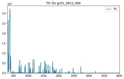
Import matplotlib and the plot_ic() function, create a subplot, and
plot the TIC:
In [3]:
import matplotlib.pyplot as plt
from pyms.Display import plot_ic

%matplotlib inline
# Change to ``notebook`` for an interactive view

fig, ax = plt.subplots(1, 1, figsize=(8, 5))

# Plot the TIC
plot_ic(ax, tic, label="TIC")

# Set the title
ax.set_title("TIC for gc01_0812_066")

# Add the legend
plt.legend()

plt.show()
In addition to the TIC, other arguments may be passed to plot_ic().
These can adjust the line colour or the text of the legend entry. See
https://matplotlib.org/3.1.1/api/_as_gen/matplotlib.lines.Line2D.html
for a full list of the possible arguments.
An IonChromatogram can be plotted in the same manner as the TIC in
the example above.
When not running in Jupyter Notebook, the plot may appear in a separate window looking like this:
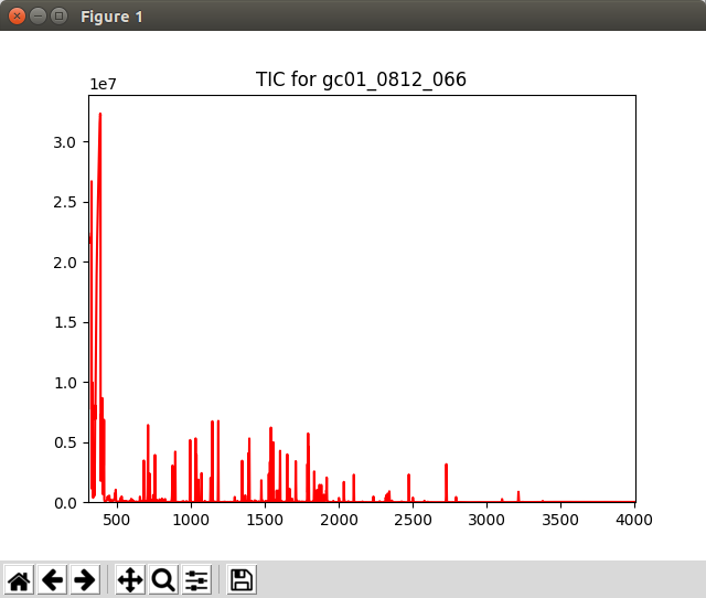
Graphics window displayed by the script 70a/proc.py
Note
This example is in pyms-demo/jupyter/Displaying_TIC.ipynb and pyms-demo/70a/proc.py.
6.2. Example: Displaying Multiple IonChromatogram Objects
Multiple IonChromatogram objects can be plotted on the same figure.
To start, load a datafile and create an IntensityMatrix as before.
In [1]:
import pathlib
data_directory = pathlib.Path(".").resolve().parent.parent / "pyms-data"
# Change this if the data files are stored in a different location

output_directory = pathlib.Path(".").resolve() / "output"

from pyms.GCMS.IO.JCAMP import JCAMP_reader
from pyms.IntensityMatrix import build_intensity_matrix_i

jcamp_file = data_directory / "gc01_0812_066.jdx"
data = JCAMP_reader(jcamp_file)
tic = data.tic
im = build_intensity_matrix_i(data)
-> Reading JCAMP file '/home/vagrant/PyMassSpec/pyms-data/gc01_0812_066.jdx'
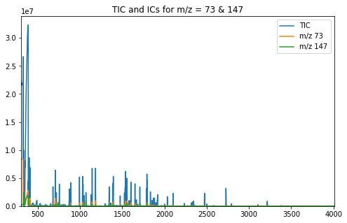
Extract the desired IonChromatograms from the IntensityMatrix .
In [2]:
ic73 = im.get_ic_at_mass(73)
ic147 = im.get_ic_at_mass(147)
Import matplotlib and the plot_ic() function, create a subplot, and
plot the ICs on the chart:
In [3]:
import matplotlib.pyplot as plt
from pyms.Display import plot_ic

%matplotlib inline
# Change to ``notebook`` for an interactive view

fig, ax = plt.subplots(1, 1, figsize=(8, 5))

# Plot the ICs
plot_ic(ax, tic, label="TIC")
plot_ic(ax, ic73, label="m/z 73")
plot_ic(ax, ic147, label="m/z 147")

# Set the title
ax.set_title("TIC and ICs for m/z = 73 & 147")

# Add the legend
plt.legend()

plt.show()
When not running in Jupyter Notebook, the plot may appear in a separate window looking like this:
Graphics window displayed by the script 70b/proc.py
Note
This example is in pyms-demo/jupyter/Displaying_Multiple_IC.ipynb and pyms-demo/70b/proc.py.
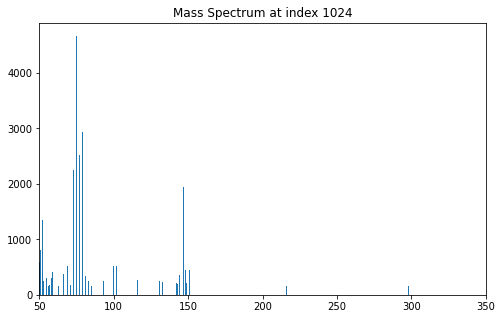
6.3. Example: Displaying a Mass Spectrum
The pyms Display module can also be used to display individual mass spectra.
To start, load a datafile and create an IntensityMatrix as before.
In [1]:
import pathlib
data_directory = pathlib.Path(".").resolve().parent.parent / "pyms-data"
# Change this if the data files are stored in a different location

output_directory = pathlib.Path(".").resolve() / "output"

from pyms.GCMS.IO.JCAMP import JCAMP_reader
from pyms.IntensityMatrix import build_intensity_matrix_i

jcamp_file = data_directory / "gc01_0812_066.jdx"
data = JCAMP_reader(jcamp_file)
tic = data.tic
im = build_intensity_matrix_i(data)
-> Reading JCAMP file '/home/vagrant/PyMassSpec/pyms-data/gc01_0812_066.jdx'
Extract the desired MassSpectrum from the IntensityMatrix .
In [2]:
ms = im.get_ms_at_index(1024)
Import matplotlib and the |plot_mass_spec()| function, create a subplot, and plot the spectrum on the chart:
In [3]:
import matplotlib.pyplot as plt
from pyms.Display import plot_mass_spec

%matplotlib inline
# Change to ``notebook`` for an interactive view

fig, ax = plt.subplots(1, 1, figsize=(8, 5))

# Plot the spectrum
plot_mass_spec(ax, ms)

# Set the title
ax.set_title("Mass Spectrum at index 1024")

# Reduce the x-axis range to better visualise the data
ax.set_xlim(50, 350)

plt.show()
When not running in Jupyter Notebook, the spectrum may appear in a separate window looking like this:
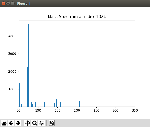
Graphics window displayed by the script 70c/proc.py
Note
This example is in pyms-demo/jupyter/Displaying_Mass_Spec.ipynb and pyms-demo/70c/proc.py.
6.4. Example: Displaying Detected Peaks
The pyms.Display.Display module also allows for detected peaks to marked on a TIC
plot.
First, setup the paths to the datafiles and the output directory, then import JCAMP_reader and build_intensity_matrix.
In [1]:
import pathlib
data_directory = pathlib.Path(".").resolve().parent.parent / "pyms-data"
# Change this if the data files are stored in a different location

output_directory = pathlib.Path(".").resolve() / "output"

from pyms.GCMS.IO.JCAMP import JCAMP_reader
from pyms.IntensityMatrix import build_intensity_matrix
Read the raw data files, extract the TIC and build the
IntensityMatrix .
In [2]:
jcamp_file = data_directory / "gc01_0812_066.jdx"
data = JCAMP_reader(jcamp_file)
data.trim("500s", "2000s")
tic = data.tic
im = build_intensity_matrix(data)
 -> Reading JCAMP file '/home/vagrant/PyMassSpec/pyms-data/gc01_0812_066.jdx'
Trimming data to between 520 and 4517 scans
Perform pre-filtering and peak detection. For more information on
detecting peaks see
“Peak detection and representation <chapter06.html>_”.
In [3]:
from pyms.Noise.SavitzkyGolay import savitzky_golay
from pyms.TopHat import tophat
from pyms.BillerBiemann import BillerBiemann, rel_threshold, num_ions_threshold

n_scan, n_mz = im.size

for ii in range(n_mz):
    ic = im.get_ic_at_index(ii)
    ic_smooth = savitzky_golay(ic)
    ic_bc = tophat(ic_smooth, struct="1.5m")
    im.set_ic_at_index(ii, ic_bc)

# Detect Peaks
peak_list = BillerBiemann(im, points=9, scans=2)

print("Number of peaks found: ", len(peak_list))

# Filter the peak list, first by removing all intensities in a peak less than a
# given relative threshold, then by removing all peaks that have less than a
# given number of ions above a given value

pl = rel_threshold(peak_list, percent=2)
new_peak_list = num_ions_threshold(pl, n=3, cutoff=10000)

print("Number of filtered peaks: ", len(new_peak_list))
Number of peaks found:  1467
Number of filtered peaks:  72
Get Ion Chromatograms for 4 separate m/z channels.
In [4]:
ic191 = im.get_ic_at_mass(191)
ic73 = im.get_ic_at_mass(73)
ic57 = im.get_ic_at_mass(57)
ic55 = im.get_ic_at_mass(55)
Import matplotlib, and the plot_ic() and plot_peaks() functions.
In [5]:
import matplotlib.pyplot as plt
from pyms.Display import plot_ic, plot_peaks
Create a subplot, and plot the TIC.
In [6]:
%matplotlib inline
# Change to ``notebook`` for an interactive view

fig, ax = plt.subplots(1, 1, figsize=(8, 5))

# Plot the ICs
plot_ic(ax, tic, label="TIC")
plot_ic(ax, ic191, label="m/z 191")
plot_ic(ax, ic73, label="m/z 73")
plot_ic(ax, ic57, label="m/z 57")
plot_ic(ax, ic55, label="m/z 55")

# Plot the peaks
plot_peaks(ax, new_peak_list)

# Set the title
ax.set_title('TIC, ICs, and PyMS Detected Peaks')

# Add the legend
plt.legend()

plt.show()
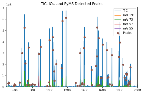
The function plot_peaks() adds the PyMassSpec detected peaks to the
figure.
The function store_peaks()
in proc_save_peaks.py stores the peaks, while
load_peaks()
in proc.py loads them for the Display class to use.
When not running in Jupyter Notebook, the plot may appear in a separate window looking like this:
Graphics window displayed by the script 71/proc.py
Note
This example is in pyms-demo/jupyter/Displaying_Detected_Peaks.ipynb and pyms-demo/71/proc.py.
6.5. Example: User Interaction With The Plot Window
The class pyms.Display.ClickEventHandler allows for additional interaction with
the plot on top of that provided by matplotlib.
Note: This may not work in Jupyter Notebook
To use the class, first import and process the data before:
In [1]:
import pathlib

import matplotlib.pyplot as plt

from pyms.GCMS.IO.JCAMP import JCAMP_reader
from pyms.IntensityMatrix import build_intensity_matrix
from pyms.Display import plot_ic, plot_peaks
from pyms.Noise.SavitzkyGolay import savitzky_golay
from pyms.TopHat import tophat
from pyms.BillerBiemann import BillerBiemann, rel_threshold, num_ions_threshold
In [2]:
data_directory = pathlib.Path(".").resolve().parent.parent / "pyms-data"
# Change this if the data files are stored in a different location

output_directory = pathlib.Path(".").resolve() / "output"
In [3]:
jcamp_file = data_directory / "gc01_0812_066.jdx"
data = JCAMP_reader(jcamp_file)
data.trim("500s", "2000s")
tic = data.tic
im = build_intensity_matrix(data)
 -> Reading JCAMP file '/home/vagrant/PyMassSpec/pyms-data/gc01_0812_066.jdx'
Trimming data to between 520 and 4517 scans
In [4]:
n_scan, n_mz = im.size

for ii in range(n_mz):
    ic = im.get_ic_at_index(ii)
    ic_smooth = savitzky_golay(ic)
    ic_bc = tophat(ic_smooth, struct="1.5m")
    im.set_ic_at_index(ii, ic_bc)
In [5]:
peak_list = BillerBiemann(im, points=9, scans=2)
pl = rel_threshold(peak_list, percent=2)
new_peak_list = num_ions_threshold(pl, n=3, cutoff=10000)

print("Number of filtered peaks: ", len(new_peak_list))
Number of filtered peaks: 72
Creating the plot proceeds much as before, except that
pyms.Display.ClickEventHandler must be called before
plt.show().
You should also assign this to a variable to prevent it being garbage collected.
In [6]:
from pyms.Display import ClickEventHandler

%matplotlib inline
# Change to ``notebook`` for an interactive view

fig, ax = plt.subplots(1, 1, figsize=(8, 5))

# Plot the TIC
plot_ic(ax, tic, label="TIC")

# Plot the peaks
plot_peaks(ax, new_peak_list)

# Set the title
ax.set_title('TIC for gc01_0812_066 with Detected Peaks')

# Set up the ClickEventHandler
handler = ClickEventHandler(new_peak_list)

# Add the legend
plt.legend()

plt.show()
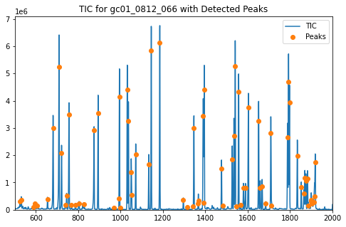
Clicking on a Peak causes a list of the 5 highest intensity ions at that Peak to be written to the terminal in order. The output should look similar to this:
RT: 1031.823
Mass     Intensity
158.0    2206317.857142857
73.0     628007.1428571426
218.0    492717.04761904746
159.0    316150.4285714285
147.0    196663.95238095228
If there is no Peak close to the point on the chart that was clicked, the the following will be shown in the terminal:
No Peak at this point
The pyms.Display.ClickEventHandler class can be configured with a different
tolerance, in seconds, when clicking on a Peak, and to display a
different number of top n ions when a Peak is clicked.
In addition, clicking the right mouse button on a Peak displays the mass spectrum at the peak in a new window.
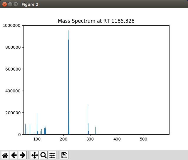
The mass spectrum displayed by PyMassSpec when a peak in the graphics window is right clicked
To zoom in on a portion of the plot, select the  button,
hold down the left mouse button while dragging a rectangle over
the area of interest. To return to the original view, click on the
button,
hold down the left mouse button while dragging a rectangle over
the area of interest. To return to the original view, click on the
 button.
The  button allows panning across the zoomed plot.
Note
This example is in pyms-demo/jupyter/Display_User_Interaction.ipynb and pyms-demo/72/proc.py.